purple Reign
Design does not like to follow rules, but it does love a good colour forecast. For that, the industry looks towards the Pantone Color Institute — our chromatic barometer of style, fantasy and cultural reckoning.
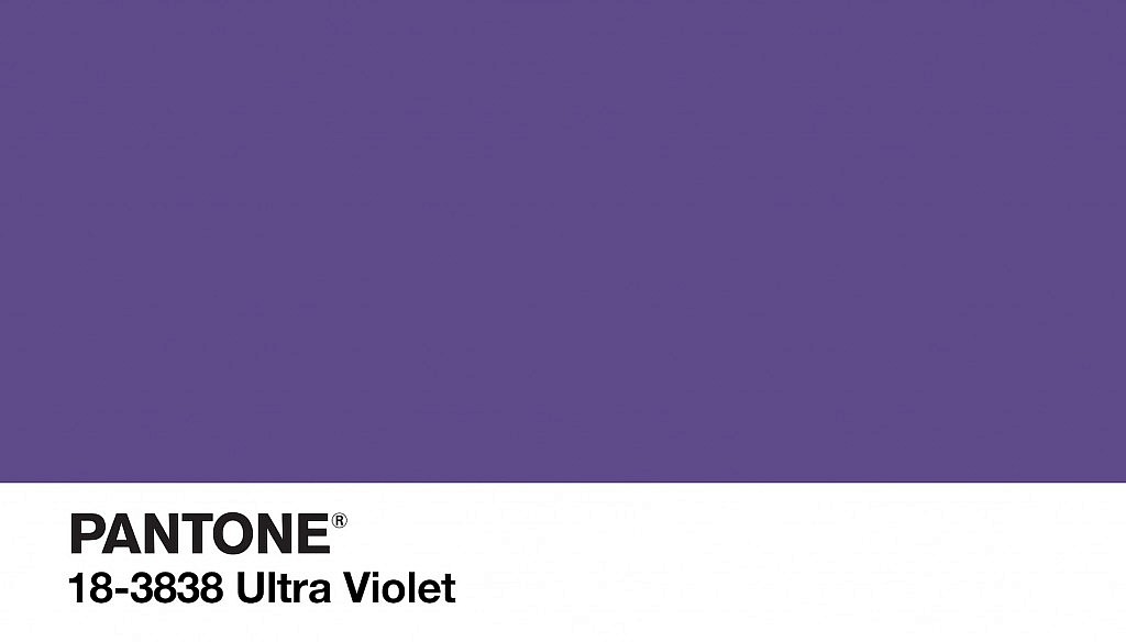
The organization’s recently announced Colour of the Year sends a volt of attitude into the interiors world with PANTONE 18-3838 Ultra Violet — a deep, stirring hue.
“We are living in a time that requires inventiveness and imagination,” said Leatrice Eiseman, Executive Director of the Pantone Color Institute. “It is this kind of creative inspiration that is indigenous to PANTONE 18-3838 Ultra Violet, a blue-based purple that takes our awareness and potential to a higher level. From exploring new technologies and the greater galaxy, to artistic expression and spiritual reflection, intuitive Ultra Violet lights the way to what is yet to come.”
Colour is not a neutral subject, and Pantone’s annual designations are taken with all the seriousness of thesis project. The Institute analyses industries and categories across the spectrum — entertainment, fashion, new artists, travelling art collections, popular travel destinations, technology, media, social currents and socioeconomic conditions — in search of colour influences. The Colour of Year, now in its 19th edition, is an amalgam of all that input, and has consistently become a powerful platform where trends, commerce, global style directions, opinions and Pinterest boards converge.
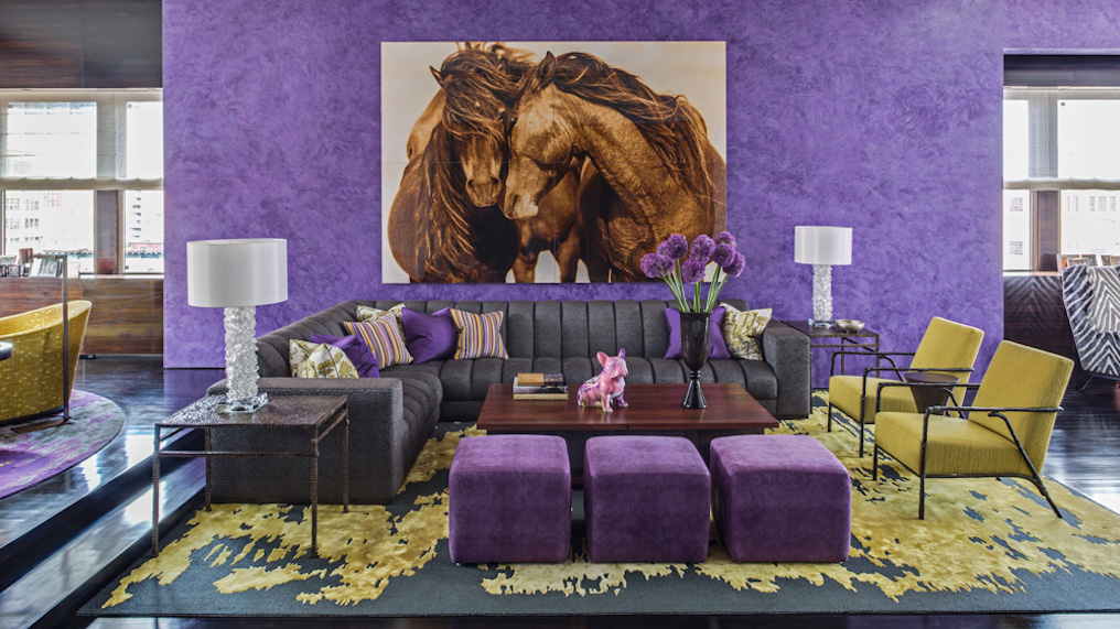
How does all of this reflection and imperial introspection affect your home life? Hopefully, it translates into some aesthetic fearlessness. The inimitable, award-winning interior designer Jamie Drake is a master of colour and approaches this colour with little hesitation. “Saturated purple isn’t a shy colour, so why be bashful when using it in your interior? We love bold effects, and if you love Ultra Violet, go for it! In a Tribeca apartment we applied it as Venetian Plaster to the walls of a living room, and repeated it in throw pillows and small ottomans. The reverse of standard logic maybe, but to powerfully positive effect.”
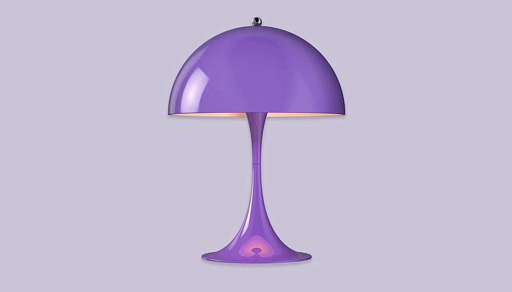
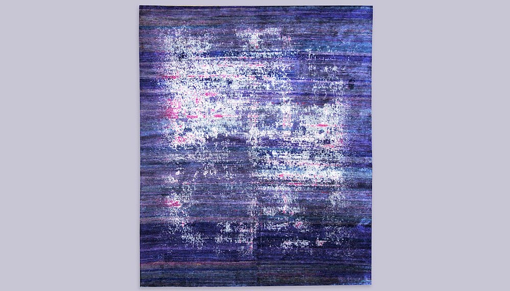
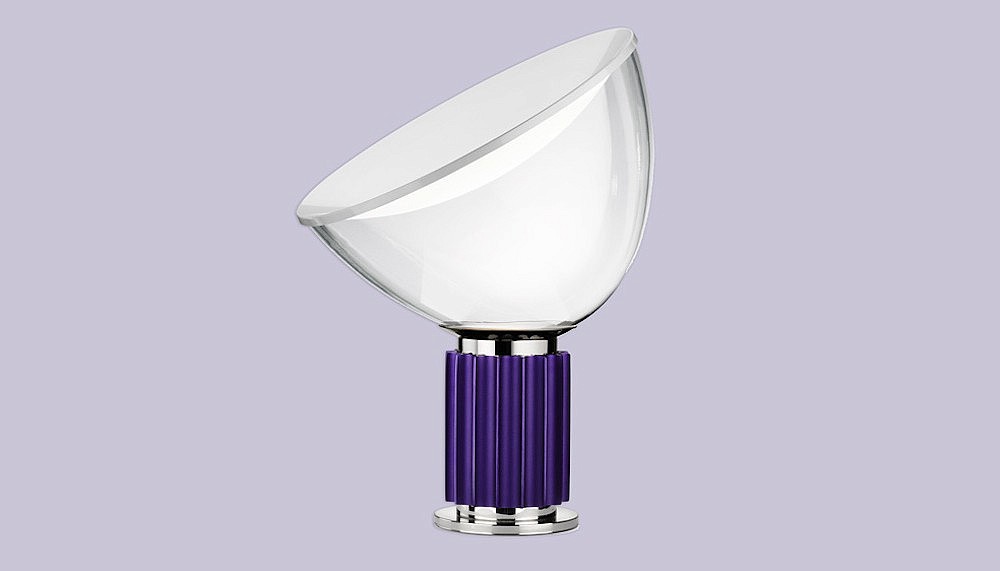
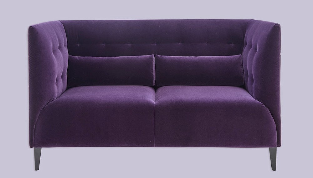
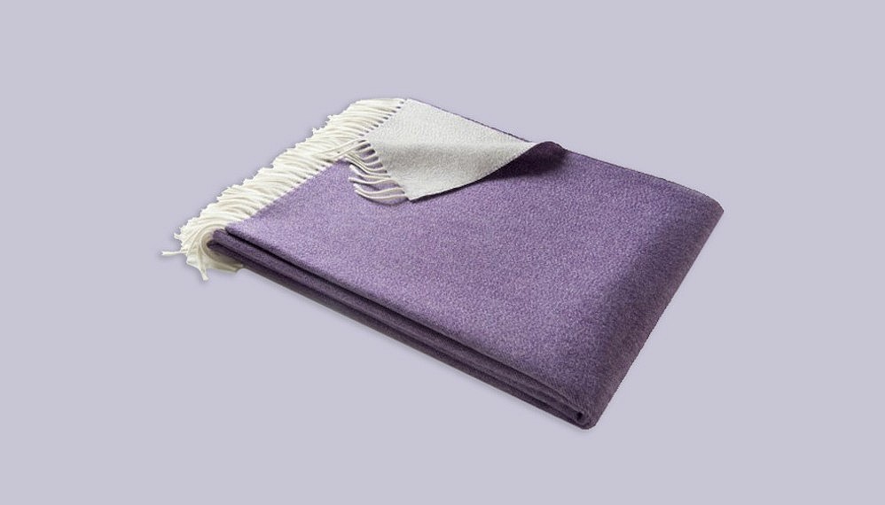
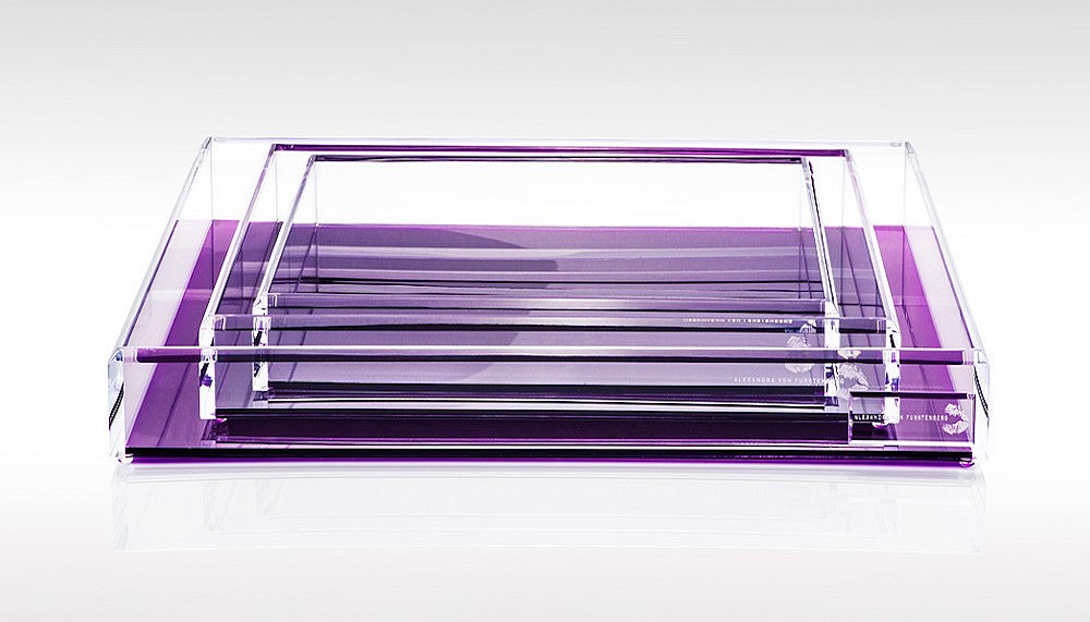
If purple surrounds feel too steadfast, or if the iconic sway of Jimi Hendrix, Prince and David Bowie just isn’t enough, Robb Report Malaysia has a few fetching options to submerge you in posh Ultra Violet rays — be it seating, art, lighting or a cashmere throw. Pantone fancies the iconoclastic nature of purple, positing: “Ultra Violet symbolises experimentation and non-conformity, spurring individuals to imagine their unique mark on the world and push boundaries through creative outlets.”
Purple flaunts an uncontended legacy, making it something of a sure thing in design. “Purple is historically a sophisticated colour,” says Drake of its potent impact. “For centuries, it has been a pigment associated with royalty, power, and wealth. Sophistication and suavity come naturally to the richness of purple.”