From The Rubik’s Cube To The Jaguar E Type And Sagrada Familia, Here Are The Best Designs Of Our Time

Writer Andrew Leci gives us his magnificent seven; a somewhat idiosyncratic take on the designs that have meant the most to him in his long life and short career.
This article comes with a warning: if you consider yourself an intellectual, look away now.
Rubik’s Cube

As a young person, I was obsessed with it. My cube went everywhere with me as I spent every spare moment at first trying to solve it, and then attempting to improve my solution times. Invented in 1974 by professor of architecture, Ernő Rubik, it was either a tool for teaching students how to understand three dimensional objects, or a way of solving a structural problem. In any event, it has become the most sold ‘toy’ in history and speaks to the human condition as a masterpiece of design. When scrambled (in its billions upon billions of permutations) it is haphazard and chaotic. When solved it is aesthetically beautiful, and emblematic of the basic human need to create order out of chaos.
Sagrada Familia
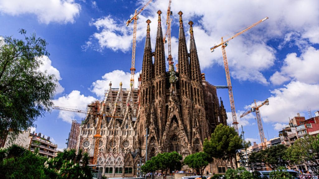
Construction started on the ‘minor basilica’ that Pope Benedict XVI consecrated in 2010 way back in 1882. And it’s not finished yet. Not nearly. Imagined by Antoni Gaudi, the architectural tour de force is a remarkable melange of the neo-gothic, naturalistic and dreamscape. The word ‘building’ doesn’t give it the credit it deserves because the creation itself is the manifestation of one man’s extraordinary vision and imagination. It simply shouldn’t work, and to this day it is among the most controversial architectural realisations on the planet, but it is utterly compelling to behold, and even more fascinating to discuss. Completion – there are 10 more spires to add – was supposed to have been in 2026, but due to the current climate, that date is now highly unlikely. It may never be completed, and what a statement that would make about an exceptional design that was never fully realised.
The Cat

As a species, felis catus has an enormous presence on YouTube – second only to human, I would suggest – and so it should. There are even annual conventions for cat videos held around the world. To my mind, it is among the best designed animals on the planet. It’s omnivorous, which is convenient; has a tail for judging height when caught in a tight space, and whiskers that exactly match the width of its body, in most cases – fat cats may have eschewed this particular design element. They are energy efficient, sleeping between 75 and 80 per cent of their lives, and for humans, stroking them is therapeutic. Cats are flexible and agile, know how to land on their feet, and have retractable claws that would make for a great gadget in something without a pulse. They are also incredibly aesthetically pleasing (even the fat ones) due to their big ears (they have excellent hearing, at pitches that humans wouldn’t even be able to tune into with an FM radio) adaptable eyes (they’re not brilliant with colours but they can spot a mouse or a vulnerable sofa from a mile away) and sharp teeth that hint at their forebears and cousins but with only a small percentage of the menace and threat to human life. Most importantly, they look majestic in slow motion, and if that’s not a noteworthy design element then I don’t know what is.
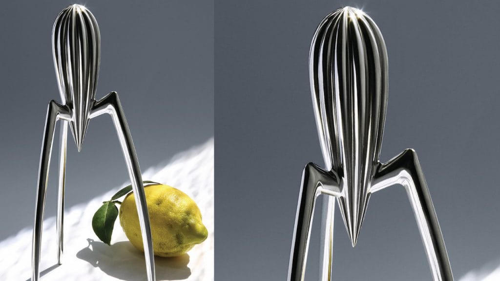
“It’s not meant to squeeze lemons,” said Philippe Starck, “it is meant to start conversations.” Frankly, this would have been good to know from the designer and industrial architect a few years ago – before I installed my fruit squeezer to take pride of place in my kitchen. The extraction process is rarely neat, but there is something about it that makes it acceptable to put functionality on the back burner in favour of a bit of fun and mess. Besides, the colony of ants that my partner and I are currently training, benefit greatly from the ‘offcuts’. It’s such a beautiful object – despite the fact that it doesn’t work very well – apparently sketched on a paper napkin in a restaurant in which the designer was eating, that it can easily be forgiven its sins. As a science fiction literature aficionado, every time I look at it (which is several times a day) I expect it to come to life, tell me it’s from Mars and is planning to take over, if not the world, then at least the espresso machine and the refrigerator.
Rolex Daytona
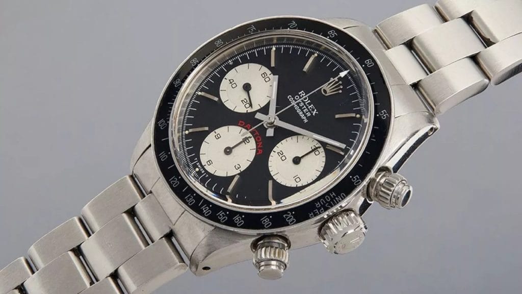
The Daytona, to my mind, is a thing of beauty, and while I can’t put my finger on exactly why, I am clearly not alone. Originally designed in 1963, it has gone through quite a few iterations, but has always retained its essential form and allure. Oddly enough, it wasn’t very popular when it first came out (and was originally called the ‘Le Mans’, until Rolex realised that the US market may have been more important than the European one and began to sponsor motorsports there). The Daytona was a departure from Rolex’s previous chronographs in that inverse-coloured sub-dials were used for the first time, and for me, this makes the timepiece special. It’s so compelling to look at that I often spend minutes of a day looking at mine and appreciating the classic design. This is just an opinion, of course, but if you have one with diamonds on it, you should be taken outside and shot. A Daytona should be stainless steel, with a black face, and that’s it. Incidentally, these models are just about the most difficult to acquire, and perfectly emblemise the superb design and the cultural icon that the watch has become over the last 58 years.
Jaguar E Type
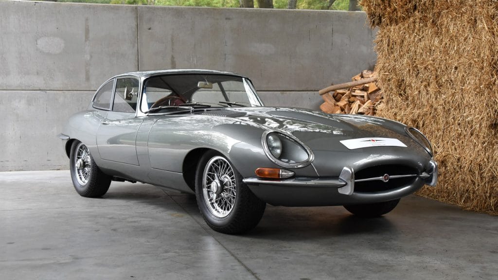
When looking at a car to include in this listicle, I had a damn good ponder. The Aston Martin DB5 came to mind (if it was good enough for James Bond, it should have been good enough for anyone), as did the enduring design of the Porsche 911 – still recognisable from its first appearance in 1964. Instead though, I have gone with the Jaguar E Type, which was, when it first hit the streets, absolutely nuts. Insane. It was a crazy design, the like of which hadn’t been seen before. Based on the racing D Type, the E Type had a monstrously long bonnet and a seemingly tiny cabin and boot. This was in the days when talk of men buying cars as penile extensions was not as prevalent as it is today. In 1961, Enzo Ferrari described it as “the most beautiful car ever made”, and he knew a thing or two. Quite apart from its stunning good looks and radical design, the actual mechanics were ground-breaking and inspired future generations in the automotive industry.
Guernica

It might not be appropriate to include an artwork in this piece, but I don’t care. When Pablo Picasso painted it in 1937, he knew what he was striving for and what he wanted to achieve from an aesthetic and emotional perspective. This required the compilation of design elements (all nasty and all suffering). They are so perfectly put together in this one monumental piece that I defy anyone not to be moved by them and it. Apart from being, arguably, the most significant anti-war painting in the history of art, it is also a work that roots you to the spot the first time you see it. And the second. And the third.
There you have it; my seven pillars. It occurs to me that they all have something in common, to wit, they all have major flaws. Rubik’s Cube was easy to break, especially through overuse. The Sagrada Familia has been referred to as an ‘eyesore’, and to this day polarises opinions. The Cat isn’t everyone’s cup of tea, being aloof, judgmental, and arrogant, while the Juicy Salif isn’t very good at doing the job for which it wasn’t intended, according to Philippe. The Rolex Daytona in stopwatch action isn’t very easy to read, and the Jaguar E Type guzzled oil like it was going out of fashion and was almost impossible to park. And as for Guernica… It isn’t universally loved as an artwork and was always controversial. But as Salvador Dali once said, “have no fear of perfection; you’ll never reach it.”
Lead photo: Claudio Testa / Unsplash


